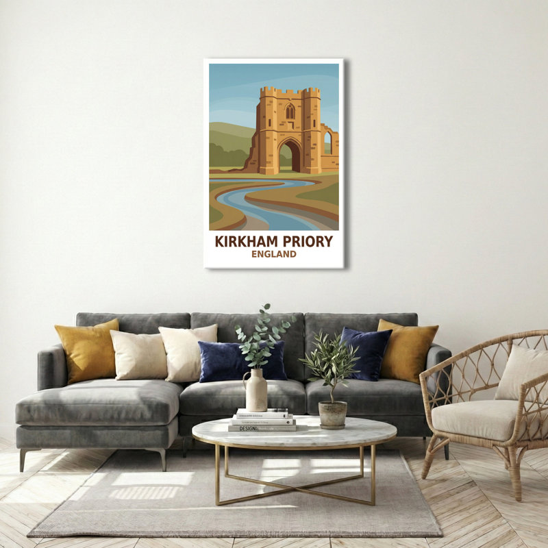
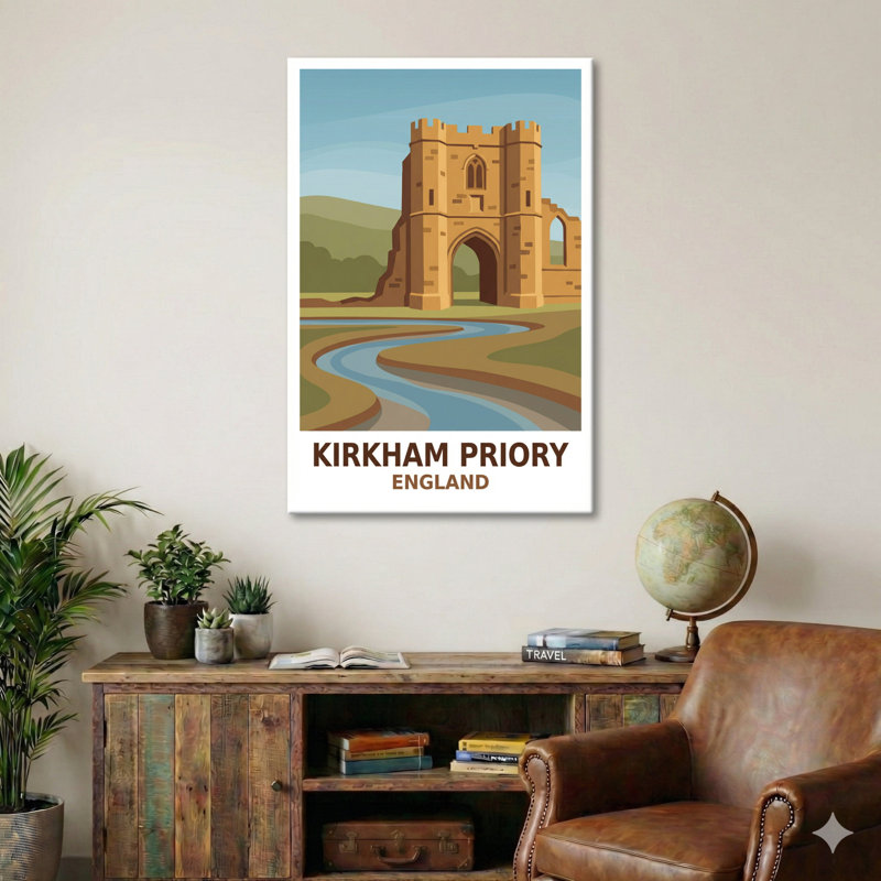
Kirkham Priory sits like a reverie on the edge of the English countryside - a place where stone and water meet to tell centuries of quiet stories. The priory's ruined arches and tower still hold the echo of medieval devotion, while the surrounding meadows and the slow ribbon of river invite long, thoughtful walks. This travel poster celebrates that romance: a paean to timeworn stone, rolling landscape and the gentle curiosity that draws people to historic corners of England.
Walkers and day-trippers come to Kirkham for a sense of pause. The priory's silhouette, softened by weather and age, looks out over low hills and meandering water. In the poster the ruin becomes a landmark and a promise - an architectural doorway that hints at lives once ordered by ritual and now open to the sky. There is a distinct feeling of discovery here; visiting feels like stepping into a story that already has its edges smoothed by wind and rain.
The design takes inspiration from classic travel posters, where bold shapes and simplified colour fields suggest both place and mood. Warm sandstone tones give the priory its sunlit presence, balanced against soft blues of the sky and river and muted greens of pasture and distant hills. The palette is deliberately restrained: ochres, sage and slate blend to create a tranquil, slightly nostalgic atmosphere that looks superb on any wall.
Stylistically, the poster leans into a timeless, stylised look rather than literal detail. Arches and windows are suggested with clean lines; the river is a flowing band of colour that leads the eye through the composition. Typography echoes the travel-poster tradition - strong, confident lettering set beneath the image to announce the place with affection and clarity. The overall mood is calm and inviting, a reminder that travel needn't be loud to be memorable.


 or
 18+, T&C apply, Credit subject to status.