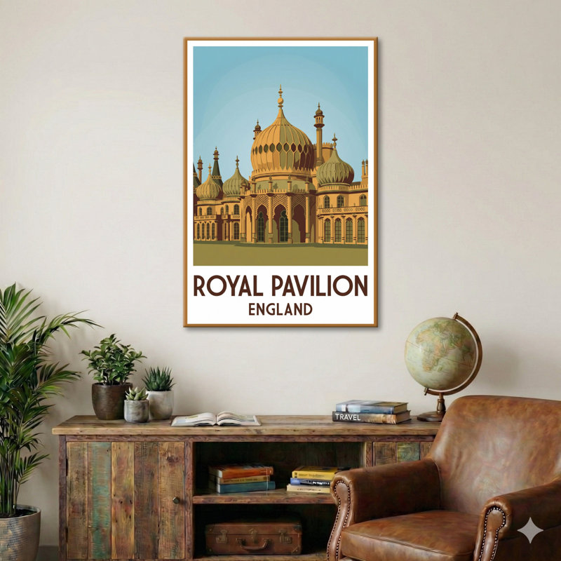
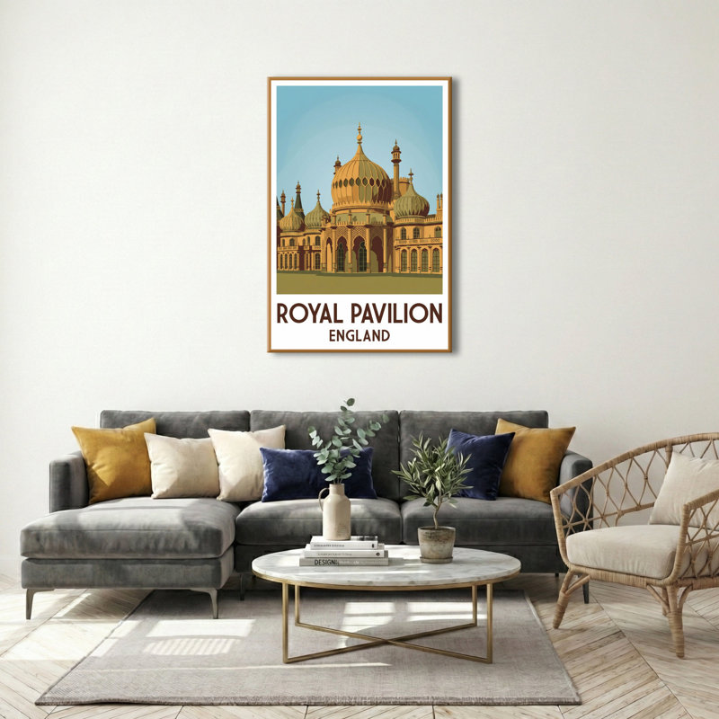
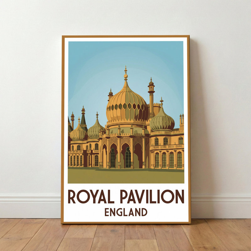
Perched by the sea, the Royal Pavilion stands like a fairy-tale mirage - a Regency palace that turned Brighton from a quiet fishing town into England's most fashionable seaside retreat. Commissioned in the early 19th century as a lavish getaway, the Pavilion's onion domes and minarets are an unexpected flourish on the Sussex coast, a rencontre between British elegance and exotic imagination.
This travel poster pays homage to that unlikely romance. It celebrates the Pavilion's story: the era of carriage promenades, bright umbrellas on the esplanade and evenings lit by gaslight. Imagined in the language of vintage travel art, the composition reduces the Pavilion's ornate silhouette to clean, confident shapes. Arches, lattices and domes are rendered in simplified planes that make the building feel both monumental and intimate - as if the viewer might stroll under those arches and into a Regency ball.
The colour palette is a deliberate nod to seaside afternoons and candlelit interiors: warm ochres and burnished golds for stonework, sage and olive for shadowed recesses, and a clear, cool teal for the sky. These colours evoke sun-warmed façades and the sea's glint beyond the lawns. Light becomes a character here - soft, low and romantic - suggesting the hush of sunset over the promenade or the hopeful glow before a night of music and conversation.
Typography plays its part in the poster's mood. Bold, elegant lettering anchors the image in the tradition of 20th-century travel posters, giving a sense of destination and invitation. The typeface is optimistic and confident, whispering of journeys yet to be taken and postcards sent home. Together with the graphic layout, it makes the Pavilion feel like a promise: of discovery, of pleasure, of a corner of England where history and seaside life intertwine.


 18+, T&C apply, Credit subject to status.Learn more